Vitasource
Brand ID and packaging design
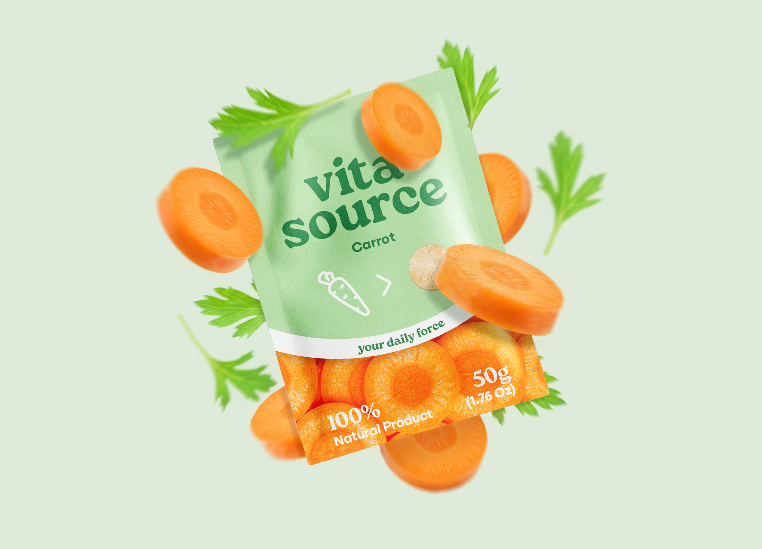
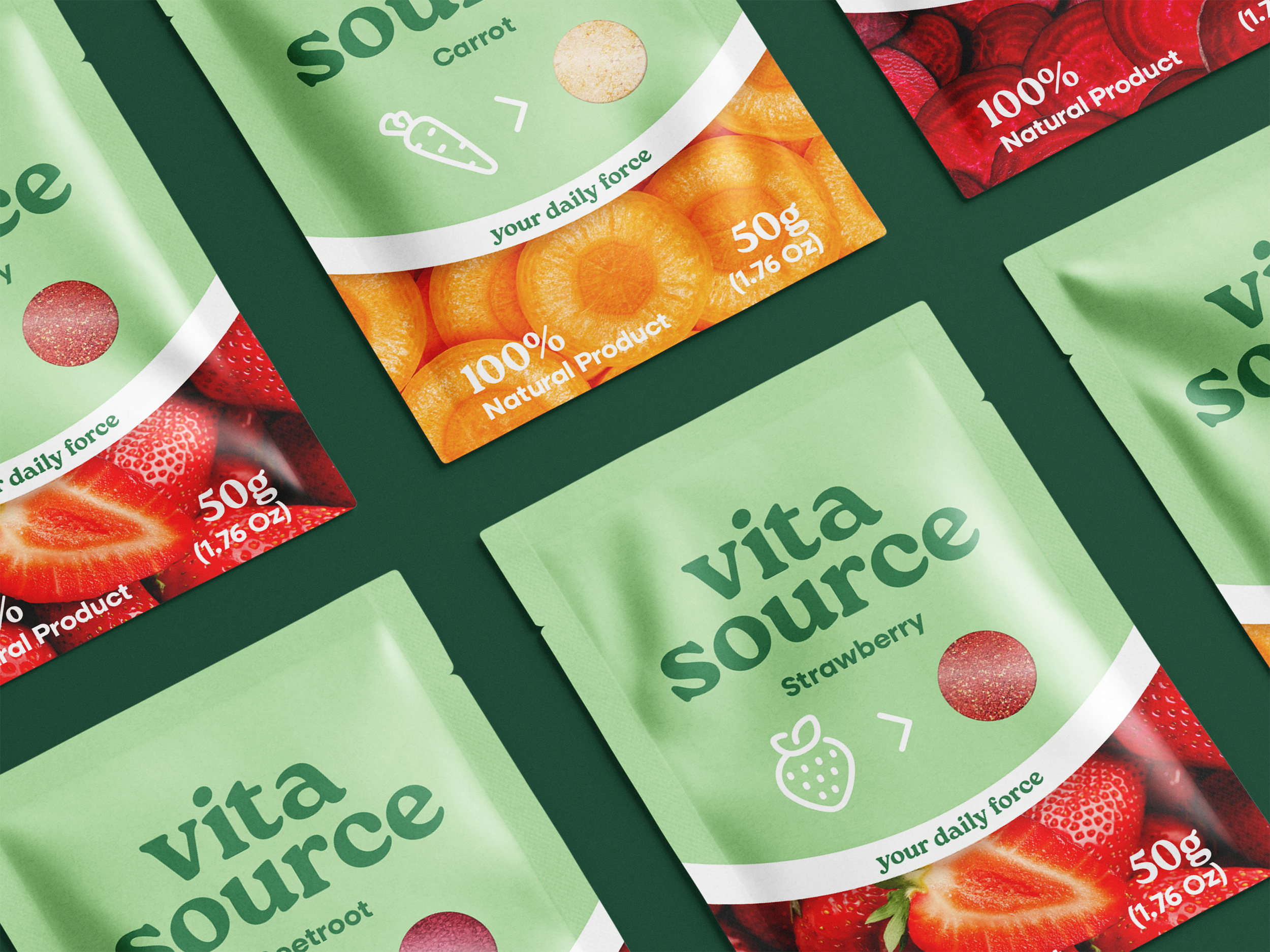
Vita Source packaging is built on a strategic design and marketing approach, crafted to not just hold a product but to inspire everyday cooking and baking. The design uses elegant yet bold playful typography that radiates enthusiasm and positivity, turning the pack into an instant mood-lifter. A clean white curve across the middle works on a subconscious level, creating an emotional trigger of trust and optimism. At the bottom, images of fresh cut fruits and vegetables activate the salivary glands, sparking appetite and supporting sales by linking the product to taste and indulgence.
The visual icon system — a vegetable or fruit icon leading with an arrow into a small window of powder — communicates both transformation and transparency, highlighting the eco-friendly, honest nature of the product. On the back, four key vitamins reinforce the health benefits, making the design not only eye-pleasing and modern but also a business-driven tool that connects emotionally with customers and drives purchasing decisions.