SerKerFeel
Brand ID and packaging design
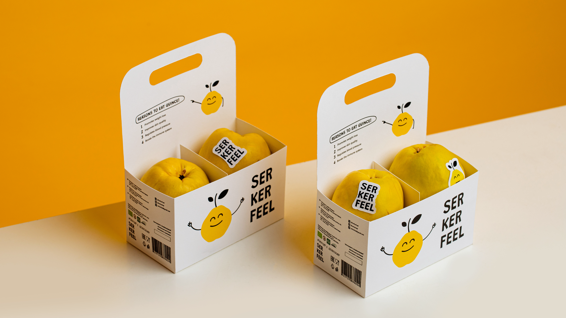
The creative concept of branding is built around the idea of the brand’s sustainability and the use of organic farming techniques to produce top-quality fruits. To emphasize the fruit and its benefits, the branding included details that would highlight the unique flavor of quince, the love and care put into every step of cultivation, and the brand's commitment to environmental protection.
The branding managed to deliver the brand's unique story through a compelling story, a creative and catchy name, and a simple yet show-stopping logo, bringing all details into harmony. As a result, the SerKerFeel brand successfully launched its organic quince fruit to the market, receiving positive feedback from customers who appreciate healthy and sustainable products.